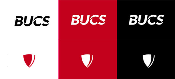
Today we launched a set of new logos, in the first step to refresh our look, grow our brand and make people aware of the game-changing things that university sport delivers.

We know lots of people loved our old look, and we felt the same. But we had to evolve, we needed to modernise, and we wanted to tie everything we do together.
So here we are. We worked to create a new and more cohesive, inclusive and acceessible identity.
The new logo uses a simple design and, we believe, is more refined, but still contains the spirit of the original. It’s an evolution. One that can scale easily, and work better in many more places.

We won’t bore you with the intricate details of every meticulously designed curve, swoosh and piece of typography, but instead we will leave you with the buzz of a new brand and the excitement it brings – new look, new ambitions, new possibilities.
So, don’t be too surprised when things on our website, social media, BUCS Play or emails look a little different. Be safe in the knowledge that we’ll still deliver the gold-standard competitions, events and initiatives you’re used to, but now with a new identity.


